Why Web Design Matters More Than Ever for Growing Brands
Growth changes the job of a website.
A new business can get away with a simple online presence for a while. A homepage, a services page, a contact form, and maybe a few testimonials are often enough to get the first wave of customers through the door. But once a brand starts gaining traction, the website stops being a placeholder and starts acting like infrastructure. It shapes first impressions, filters leads, supports sales conversations, answers objections, and often determines whether a visitor trusts the company enough to take the next step.
That shift is exactly why web design matters more than ever for growing brands. Not because design is decoration, and not because every company needs the latest visual trend. It matters because growth creates complexity. More traffic, more competition, more marketing channels, more customer expectations, and less room for friction. At that stage, weak design starts costing money.
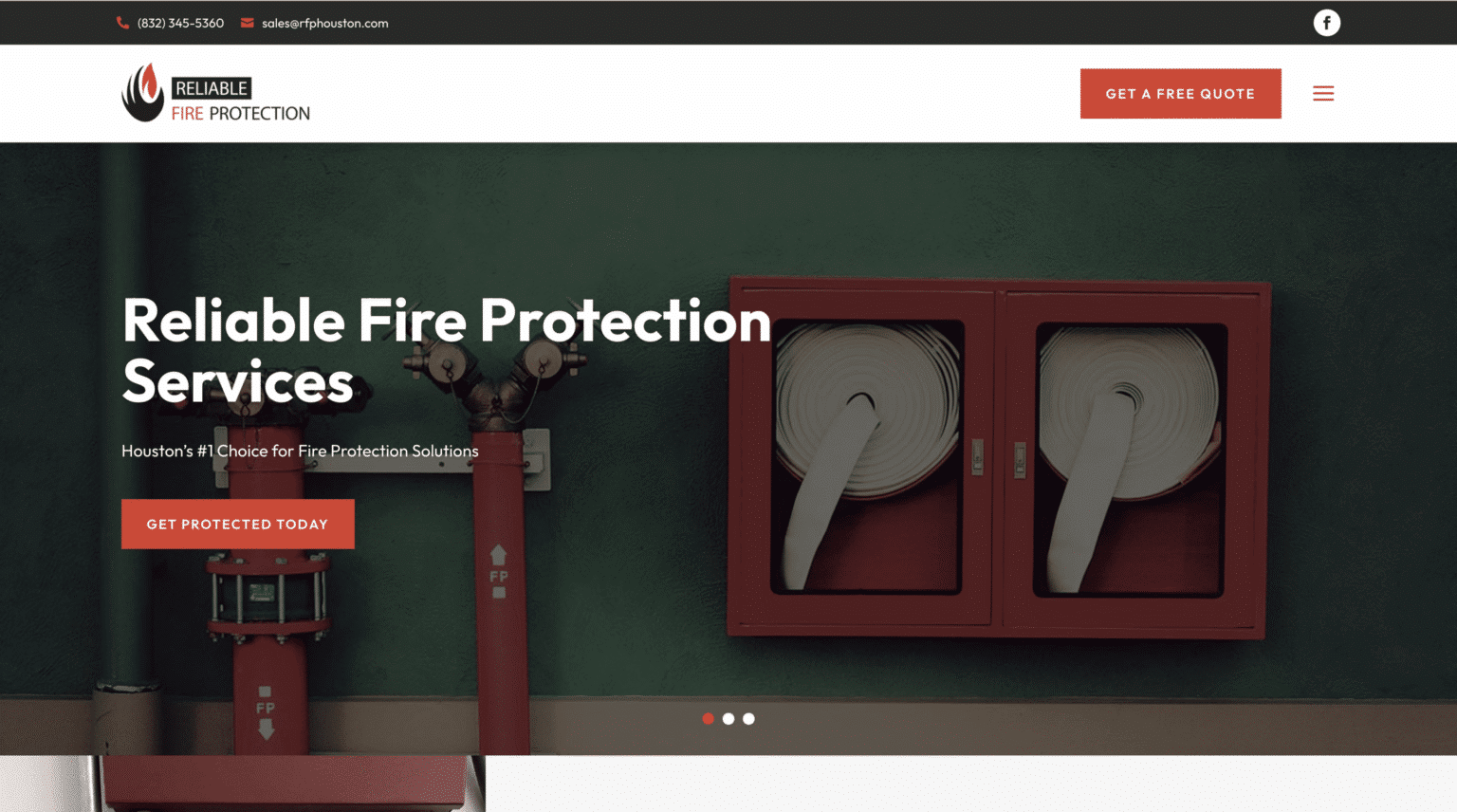
I have seen this happen repeatedly with service businesses, retailers, consultants, and local brands trying to move from “doing fine” to “serious growth.” They invest in ads, sharpen their messaging, hire salespeople, and improve operations, yet the website still feels like it belongs to the version of the business they were two years ago. That mismatch creates drag. People notice it quickly, even if they cannot articulate why.
Growth exposes every weak spot in a website
When a business is small, a website can survive on the owner’s reputation, referrals, and a bit of goodwill. Prospects who already know the brand are more forgiving. They will click around, piece things together, and contact the company even if the experience is clunky.
As the brand expands, a much larger percentage of visitors arrives cold. They do not know the founder. They have not been personally referred. They are comparing three or four alternatives in separate tabs, and they are making fast judgments. In that context, web design becomes one of the clearest signals of competence.
A dated layout, confusing navigation, weak mobile performance, thin service pages, or generic visuals can undermine excellent businesses. People tend to assume the digital experience reflects the operational experience. If the website feels careless, they worry the work may be careless too. If the site is hard to use, they expect the company to be hard to work with.
This is not vanity. It is pattern recognition. Buyers use design cues to estimate risk.
That is especially true for higher-ticket decisions. A person spending $200 on a casual product might tolerate some friction. A buyer choosing a law firm, contractor, medical practice, consultant, or software provider will read the website more closely. They want signs of professionalism, clarity, and stability. Design either supports that trust or quietly erodes it.
Design is no longer separate from brand strategy
Years ago, many companies treated branding, copywriting, and website design as separate exercises. The logo came first, the website came later, and the messaging got dropped in wherever it fit. That approach rarely works for a growing brand.
Strong website design is where brand strategy becomes tangible. It determines how positioning shows up in the real world. If a company says it is premium, the site should feel considered and polished. If it says it is efficient and straightforward, the user experience should be crisp and easy. If the brand promises personal service, the website should feel human rather than cold and corporate.
This is where many businesses slip. They update their messaging but not the actual experience. They talk about trust, expertise, and responsiveness, yet the website loads slowly, hides basic information, and forces visitors to hunt for what matters. The disconnect weakens the brand.
Effective web design aligns form and function. The typography, spacing, imagery, calls to action, page flow, and content hierarchy should all reinforce the brand promise. When those pieces work together, the website feels credible before a prospect reads every word.
That feeling matters more than many teams admit. People do not evaluate websites like auditors. They respond emotionally first, then rationally. They ask themselves, often subconsciously, “Does this look legitimate? Do I feel confident here? Is this going to be easy?” A growing brand cannot afford to leave those questions unanswered.
The best websites reduce decision fatigue
A common mistake in website design for small business is trying to say everything at once. Owners want to include every service, every audience, every credential, every benefit, and every edge case on the homepage. The result is usually a crowded, noisy experience that makes the visitor work too hard.
Good design edits.
It does not remove substance. It organizes it. It decides what belongs on the page, what belongs lower on the page, what deserves its own page, and what can be left out entirely. That discipline reduces decision fatigue, which is one of the main killers of conversion.
A growing brand often has more offerings, more case studies, and more selling points than it did in the early days. That makes design restraint even more valuable. Visitors should not have to decode the business model. They should understand who the company helps, what it does, and what step to take next within seconds.
I worked with a service business that had built a healthy referral base and wanted to scale lead generation through search and paid campaigns. Their old site was not ugly, but it was dense. Long paragraphs, inconsistent page structure, and no visual hierarchy. Bounce rates were high on mobile, and contact form submissions lagged behind traffic growth. We did not radically change the business. We clarified the web design the woodlands homepage message, cleaned up the layout, restructured service pages around buyer questions, and made the calls to action more obvious. Within a few months, lead quality improved because the right prospects finally understood what the company actually specialized in.
That kind of lift is common when design starts doing the job it should have been doing all along.
Mobile experience is now a credibility test
Many business owners still review their website mostly on desktop, usually from a large monitor in an office. Their customers do not.
For a huge share of industries, mobile traffic now accounts for half of visits or more, sometimes much more. That does not mean every conversion happens on a phone, but it does mean first impressions often do. If the mobile experience feels cramped, slow, or awkward, the brand loses trust before the sales conversation begins.
Mobile design is not just about shrinking content to fit a smaller screen. It requires different thinking. Headlines need to communicate quickly. Buttons need enough spacing to be easy to tap. Navigation must stay simple. Images should support the message without slowing the site to a crawl. Forms have to feel manageable, not punishing.
Growing brands often underestimate how many potential buyers do early research between meetings, in parking lots, on the couch at night, or while comparing options during a lunch break. Those moments are short. The site has to work immediately.
This is one reason modern web design carries more business weight than it did ten years ago. Visitor patience has dropped. Competitive options have increased. A poor mobile experience is not a minor technical flaw. It is a conversion problem.
Search visibility and design are more connected than people think
There is a persistent myth that design is what people see and SEO is what search engines see. In practice, the two are intertwined.
Search engines favor websites that are technically sound, fast, easy to navigate, and rich in useful content. Users do too. A site with poor structure usually performs badly for both audiences. If pages are hard to crawl, hard to read, or hard to use, rankings and conversions both suffer.
This matters for local service brands in particular. A business trying to compete for terms such as web design the woodlands cannot rely on a nice homepage alone. It needs a site architecture that supports local relevance, clear service pages, trustworthy signals, sensible internal linking, and a user experience that encourages visitors to stay, explore, and inquire.
The same principle applies to any company investing in content marketing or local SEO. You can publish articles, build citations, and earn backlinks, but if the site itself feels confusing or flimsy, traffic will not turn into revenue efficiently.
A growing brand should think about design and search performance as parts of the same engine. One attracts attention. The other turns attention into movement.
A better website makes every marketing dollar work harder
Design becomes even more important once a company starts spending consistently on marketing. Paid ads, email campaigns, social media, SEO, partnerships, print collateral, events, direct outreach, all of that activity pushes people toward the website. If the site underperforms, the entire system leaks.
That is why I often tell owners to stop thinking of a redesign as a visual project and start thinking of it as a conversion project. A stronger site does not just look better. It improves the return on everything feeding into it.
Consider a brand spending $3,000 to $10,000 per month on ads. If the landing experience is weak, even modest design improvements can have a meaningful financial effect. Better clarity, stronger trust signals, cleaner forms, and faster page speed may improve conversion rates enough to lower acquisition costs significantly. The traffic volume does not have to double for the business to feel the difference.
This is especially relevant in competitive local markets. If two companies offer similar services at similar prices, the one with the clearer, more trustworthy website often wins more inquiries. Not because it is necessarily better at the underlying service, but because its digital presentation removes more doubt.
That may sound unfair, but it is how buying works.
Trust is built through dozens of small design decisions
People often talk about trust as if it lives in testimonials alone. Testimonials help, of course. So do case studies, certifications, reviews, and recognizable client logos. But trust on a website is cumulative. It is built through dozens of small choices that, together, make the experience feel legitimate.
Here are a few examples that consistently matter:
- Clear messaging above the fold, so visitors know where they are and who the business serves.
- Real photography or carefully chosen visuals that match the brand instead of generic stock images that feel interchangeable.
- Consistent typography, spacing, and page structure, which signal care and professionalism.
- Specific proof points, such as years in business, service areas, outcomes, or process details.
- Straightforward contact options that make reaching out feel safe and easy.
None of these choices is dramatic on its own. Together, they shape whether the site feels dependable or improvised.
This is one reason cookie-cutter templates so often disappoint growing companies. Templates can be useful starting points, especially for early-stage brands with limited budgets. But once a business has real momentum, the website has to carry more nuance. It needs to reflect actual differentiation, not just fit content into prebuilt boxes.
Design helps qualify leads, not just attract them
One of the more overlooked benefits of strong web design is lead quality.
A better site does not simply generate more inquiries. It often generates better ones because it sets expectations properly. Clear positioning tells visitors who the business is for and who it is not for. Thoughtful page structure answers common questions before prospects ask them. Good design highlights process, pricing context, timelines, or service boundaries in ways that reduce mismatch.
That matters because growth is not just about volume. It is about efficiency. A business can burn a lot of time fielding inquiries from people who are not a fit, cannot afford the service, or misunderstand what is being offered.
I have seen website design for small business improve this dramatically. One local firm went from broad, generic language to much tighter positioning. The new site explained who they worked best with, what projects looked like, and what clients could expect during the engagement. Total inquiries dipped slightly at first, but qualified leads rose. Their close rate improved because the conversations started at a higher level. The site was doing some of the filtering that used to happen on sales calls.
That is smart design. Not flashy design, smart design.
Local brands need design that feels rooted, not generic
For businesses serving a specific city or region, local credibility matters. A website should feel connected to the market it serves. That does not mean plastering city names everywhere in awkward ways. It means showing genuine familiarity with local customers, local expectations, and local buying behavior.
For example, a firm competing in a market like The Woodlands is not just selling a service. It is selling confidence within a local context. Prospects want to know the company understands the area, responds quickly, and has experience with businesses or homeowners nearby. A thoughtful approach to web design the woodlands market can support that credibility through location-specific service pages, local imagery, useful proof, and copy that sounds grounded rather than mass-produced.
Too many local brands make the opposite mistake. Their websites look like they could belong to any company in any city. That generic feel weakens trust because local buyers often prefer specialists who seem invested in the community they serve.
Design should help a regional brand feel established, relevant, and accessible.
The redesign question is usually about timing
Business owners often ask when they should invest seriously in a website redesign. The honest answer is that the timing is usually obvious before they admit it.
A redesign is often overdue when the site no longer matches the quality of the business behind it. If the company has evolved, expanded services, moved upmarket, added a team, entered new territories, or improved its process substantially, the website should reflect that. When it does not, the business is underselling itself.
A few signs tend to show up repeatedly:
- The site looks dated compared with competitors.
- Mobile engagement is weak or forms underperform.
- The business has changed, but the messaging has not.
- Traffic is growing, yet conversions are flat.
- Sales calls keep repeating questions the website should already answer.
That does not always mean a full rebuild is necessary. Sometimes a strategic refresh is enough. Other times, patching an outdated system costs more in the long run than replacing it properly. The right choice depends on the platform, content quality, technical condition, and business goals.
The key is to evaluate the website as a working asset, not a one-time project. Growing brands review sales performance, staffing, and financials regularly. The website deserves the same seriousness.
Good design makes a brand feel ready for the next stage
There is a confidence that comes from a website that finally matches the ambition of the company behind it.
Teams feel it. Salespeople feel it when they send prospects to the site. Owners feel it when they run campaigns without worrying that the landing experience will let them down. Customers feel it when they arrive and think, almost instantly, “These people know what they are doing.”
That reaction is not superficial. It affects inquiries, close rates, perceived value, and customer trust. In some cases, it even supports pricing power. A polished, clear, credible website can make a business feel more established and less interchangeable, which matters enormously when buyers are comparing options.
There is also a momentum effect. Once the website is strong, other parts of marketing become easier. Content has a better home. Ads convert more efficiently. SEO efforts compound more effectively. Referral traffic lands on something that reinforces the recommendation instead of diluting it.
For growing brands, that is the real reason web design matters more than ever. It is not just about appearances. It is about removing friction at the exact moment the business needs leverage. It is about creating a digital experience that supports reputation, clarifies value, and helps the company operate at the level it is trying to reach.
A website should not lag behind growth. It should help drive it.
Scalable Websites
Website design for contractors and small businesses
Based in Montgomery, TX, serving Montgomery County and greater Houston
Phone: (832) 979-2478
Website: scalablewebsites.com
Hours: Monday to Friday, 8 AM to 5 PM
Scalable Websites builds and manages mobile-first websites for contractors and small businesses on simple monthly plans, with hosting, security and unlimited updates included. Find us on Google.